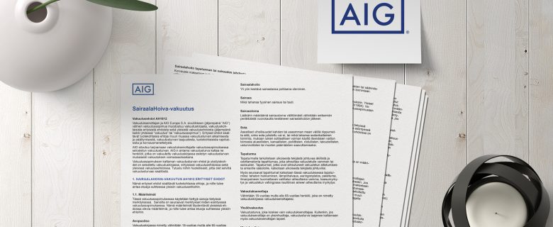
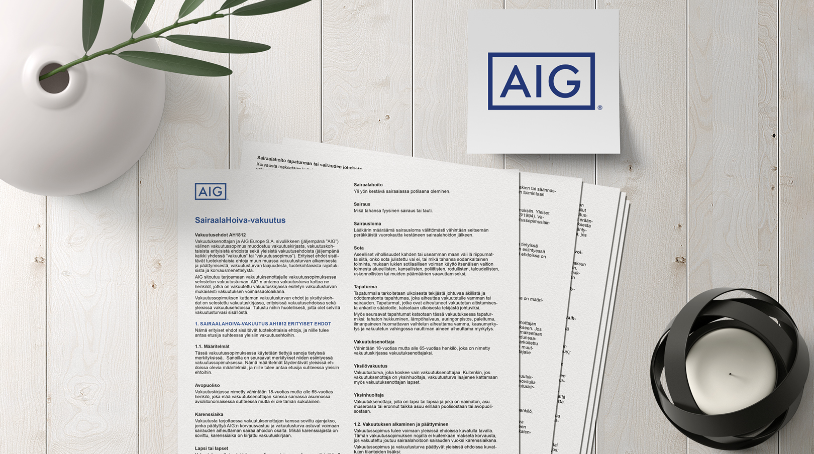
Insurance conditions layout for AIG
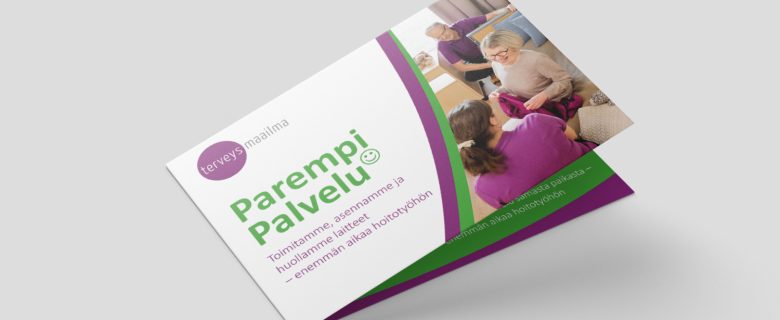
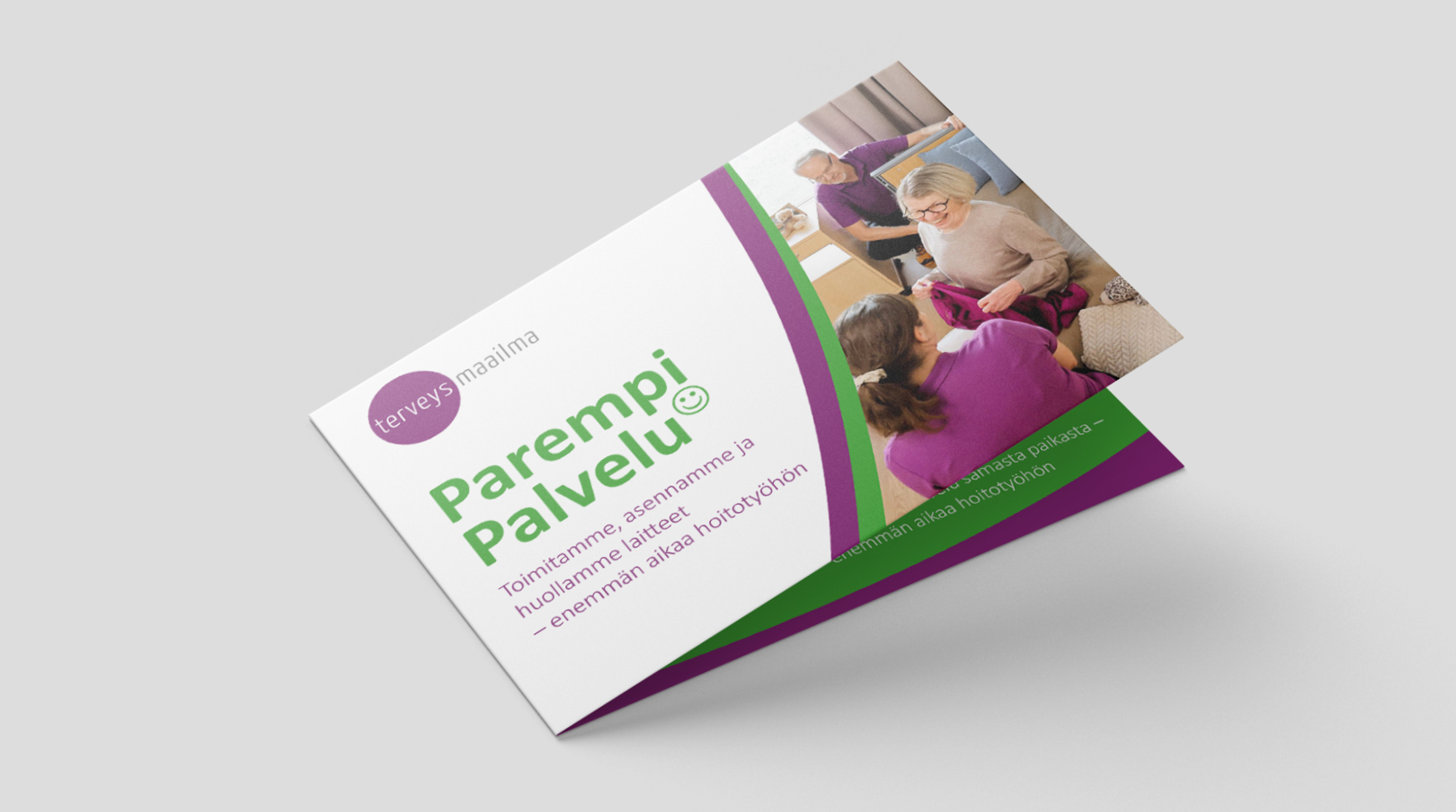
Terveysmaailma is a reliable Finnish partner for healthcare operators. We designed a foldable A5 brochure about the ParempiPalvelu (Better Service) package. terveysmaailma.fi/parempipalvelu
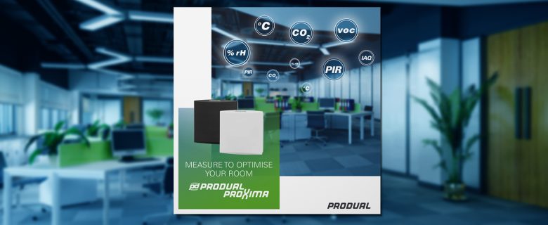
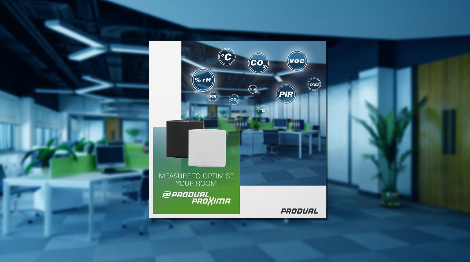
We designed the new Produal Proxima® RTX room transmitter brochure 🇬🇧 in English and 🇫🇷 in French.
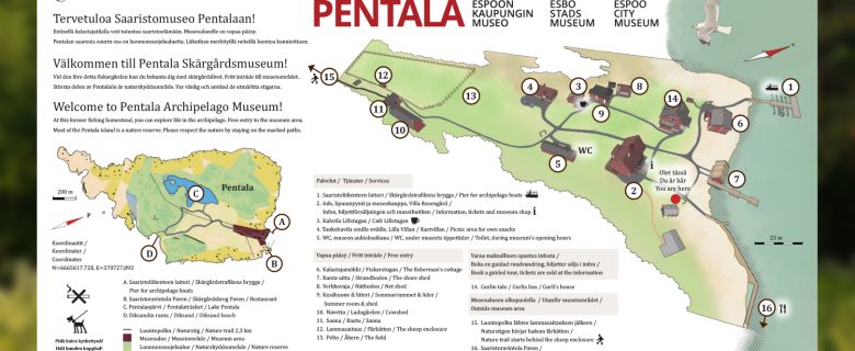
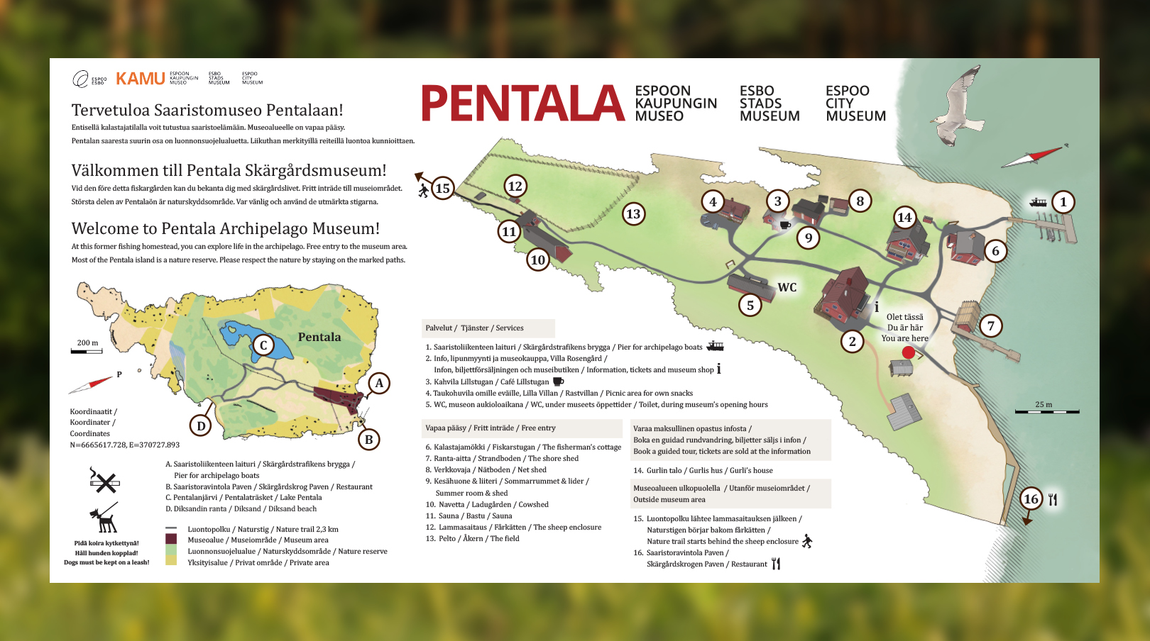
We designed signposts for the Espoo Archipelago Museum Pentala. Welcome to visit us next year at the beginning of the summer season! There is a lot to see and experience on Pentala Island. For example, there is an easily accessible and clearly marked nature trail of a couple of kilometres, 🐾 along which you can find 🐑 grazing sheep, wild coastal meadows and a natural Diksand sandy beach suitable for families with children, where you can swim in the sea water. There is also a clear-water Pentalanjärvi lake in the middle of the island. In addition to the natural attractions, Pentala Island has a restored traditional island village of a few dozen inhabitants, open to the public as a museum area. The archipelago museum offers a glimpse of island life from centuries ago. The oldest building in the museum area, a fisherman’s cottage, dates back to the early 1790s. A café and a restaurant with stunning views serve visitors, and there are coves for self-catering for lovers of meadows and beaches alike. 🌲 📍 Pentala Archipelago Museum @espoocitymuseum 🍴 Restaurant Paven @paven.fi ☕️ Café Lillstugan 🧖🏼♀️ Sauna
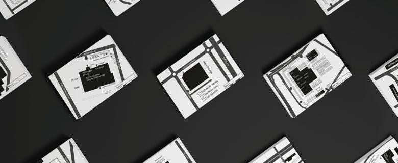
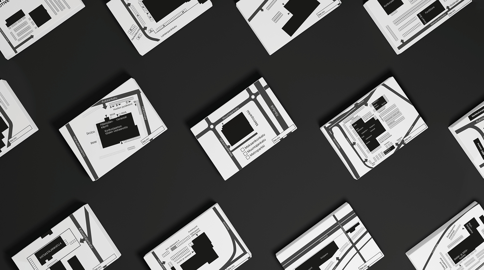
We designed property maps for the service points, on which you can mark where to drop off and pick up your car. On the back of the card, there are fields for the details of your vehicle. The maps were drawn for all Hedin Automotive and Bavaria dealerships across the country. The aim was to make it as clear as possible how to get to each dealership, each map customized taking into account the store’s individual needs and the ideal level of detail.
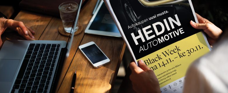
We designed a multi-channel advertising campaign for Hedin Automotive’s Black Week (or rather, Black Weeks) theme in newspapers, social media and online.
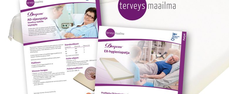
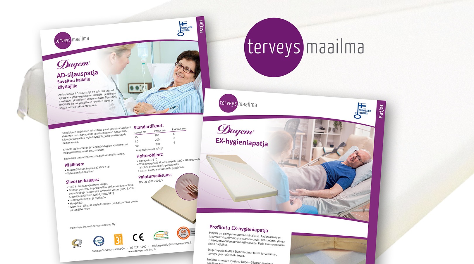
Terveysmaailma is a reliable Finnish partner for healthcare operators. We designed around forty new product leaflets for Terveysmaailma. The brochures are designed to be read in a folder that includes an index page and all products divided by product group. To help you navigate between product groups, the name of the group is also printed on the outside edge of each page. The product brochures were also produced in a pdf format that can be downloaded online. terveysmaailma.fi
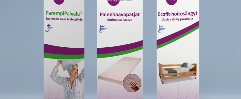
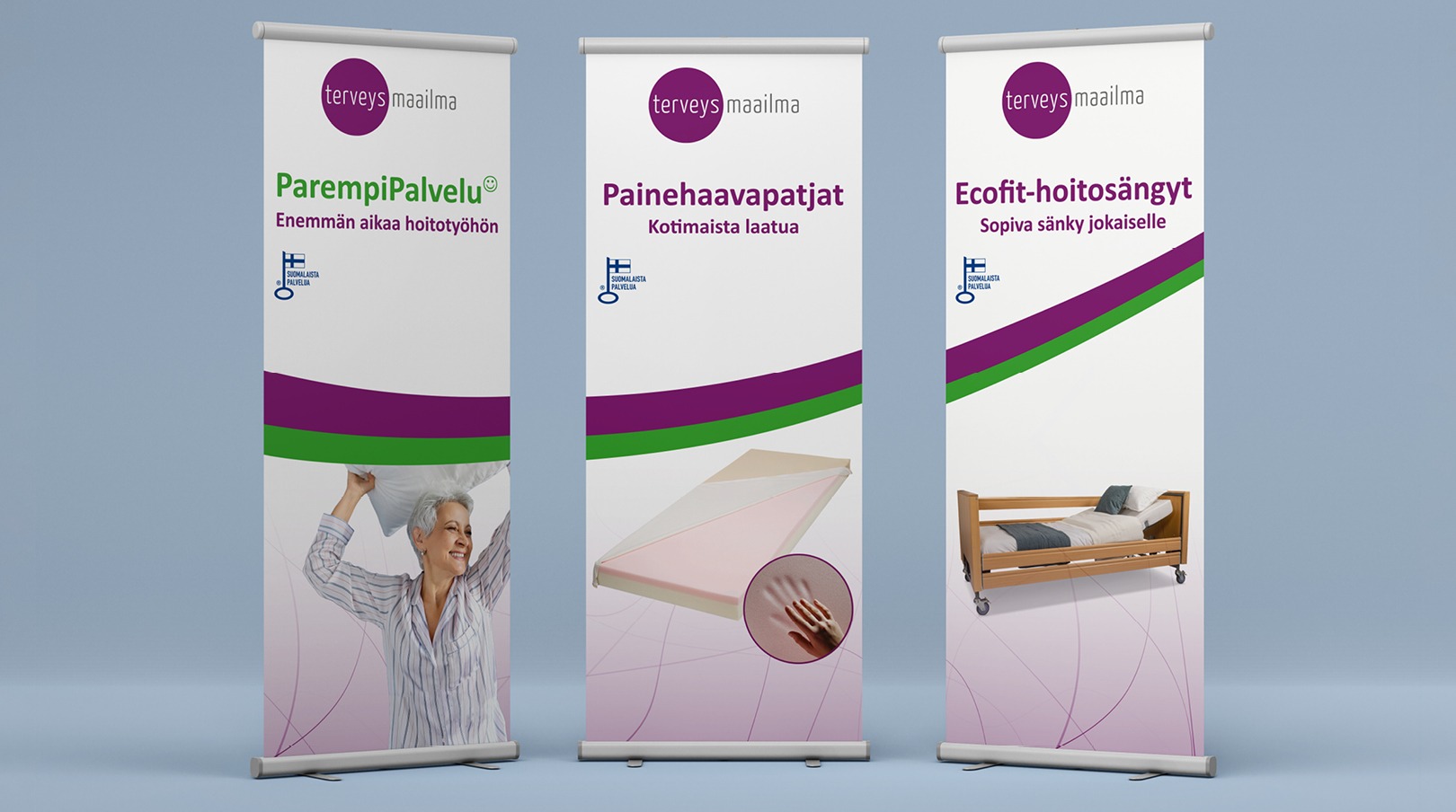
For Terveysmaailma, we designed three roll ups that work separately as well as alongside each other. terveysmaailma.fi
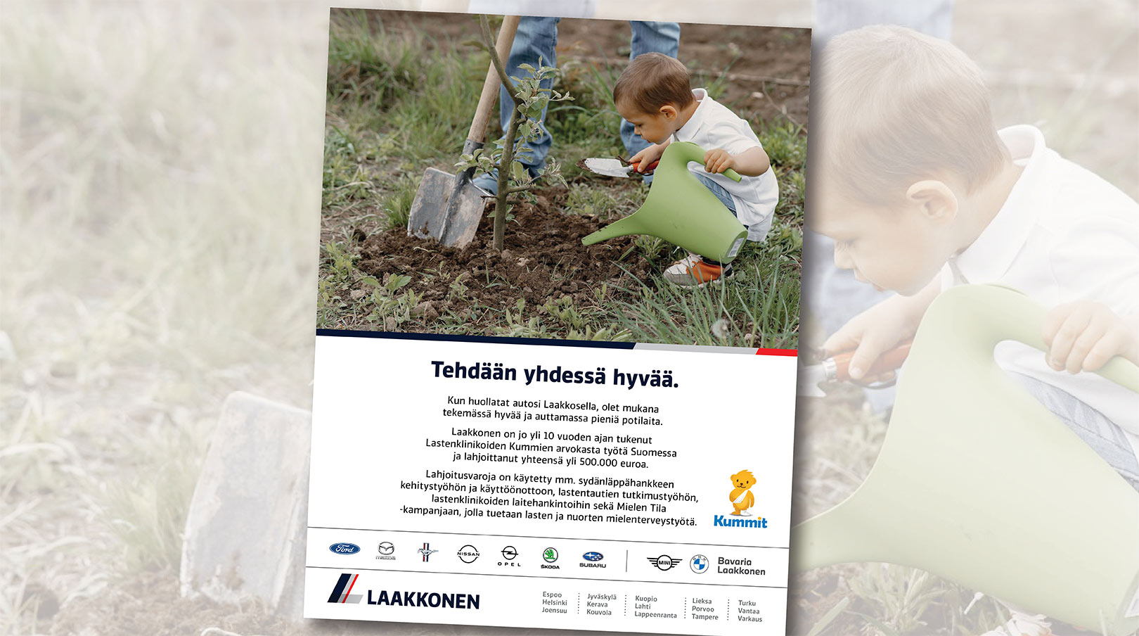
Kummit-magazine’s summer advertisement for Laakkonen.
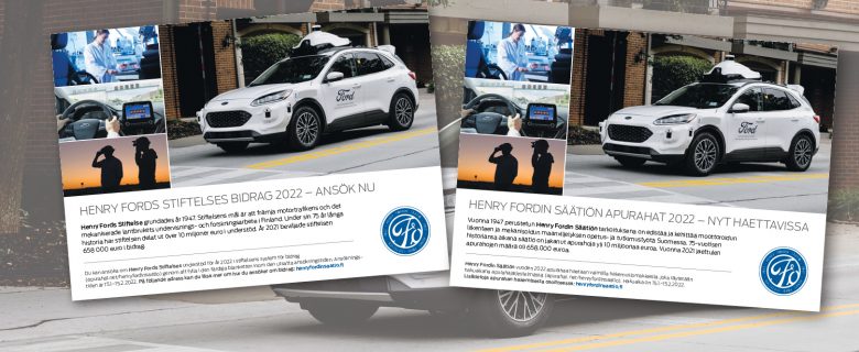
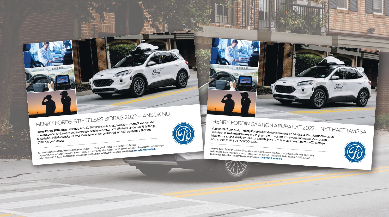
We produced print media in 2 language versions.
Brandit Advertising Oy, Aino Acktén tie 1, 00400 Helsinki, +358 400 504 705, info[at]brandit.fi
